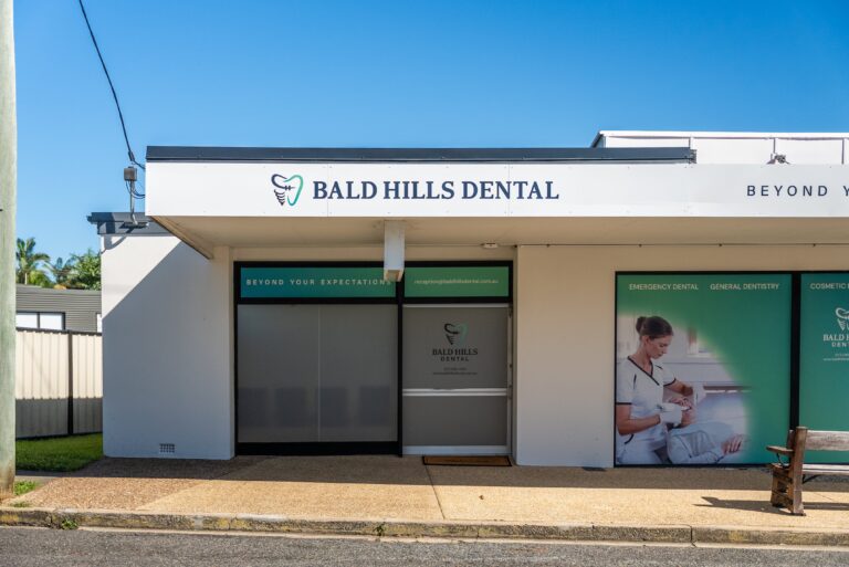
Creating a healthcare space that feels both professional and welcoming is no small feat. From GP clinics and specialist centres to dental surgeries and private hospitals, the environment plays a significant role in how patients feel, how teams function, and how the space supports healing.
Since the COVID-19 pandemic, the approach to designing healthcare environments has shifted notably. Today, there is a stronger focus on emotional well-being, hygiene, and creating comfortable, emotionally supportive spaces. Colour has become more than a design element—it’s now a crucial tool for restoring calm, reducing stress, and reinforcing trust.
In this article, we explore the psychology behind colour in healthcare, palette inspiration by room function, practical design applications for different clinic types, and how to align your choices with your brand identity. Whether you’re planning a healthcare fitout, renovation, or complete turn-key build, this guide will help you select healthcare colour palettes that elevate the experience for both patients and staff.
The Psychology of Colour in Healthcare Settings
Colour has a measurable impact on mood, behaviour, and well-being. In a healthcare setting, where emotions can run high, it can either soothe or overwhelm. Getting the balance right is key. While we intuitively know this, specific colour families have well-researched psychological and even physiological effects.
The Calming Effect of Blues
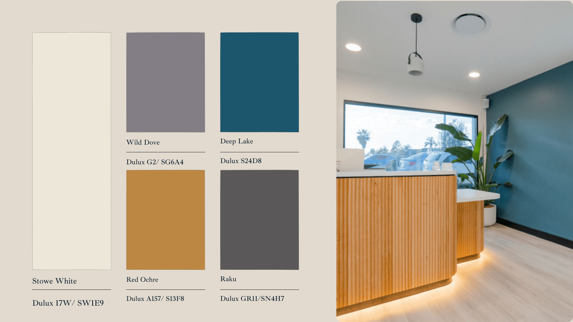
Often associated with serenity and professionalism, blue tones can help lower blood pressure and create a sense of security and trust. Light, airy blues can make a space feel open and calm, making them ideal for waiting areas or rooms where patients may feel anxious. Deeper navy or slate blues convey authority and precision, a perfect choice for high-tech specialist practices aiming to build patient confidence.
The Restorative Power of Greens
Green is the colour most associated with nature, healing, and restfulness. It connects directly to biophilia—our innate tendency to seek connections with nature for wellbeing.
Because green sits in the middle of the visual spectrum, it’s the easiest colour for the human eye to process, which can reduce eye strain and mental fatigue for both patients and staff during long consultations. Soft sage, eucalyptus, and mint green are excellent for treatment rooms and recovery wards.
The Comfort of Warm & Earthy Tones
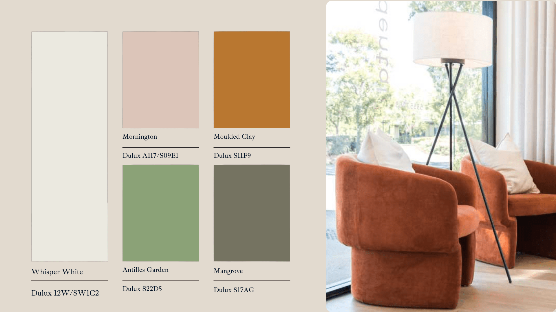
Colours like soft peach, muted terracotta, dusty rose, and warm ochre can feel grounding, inviting, and nurturing. These tones evoke a sense of homeliness and comfort, making them ideal for family clinics, wellness centres, and consultation rooms where creating a personal connection is paramount. They help spaces feel less institutional and more like a sanctuary for healing.
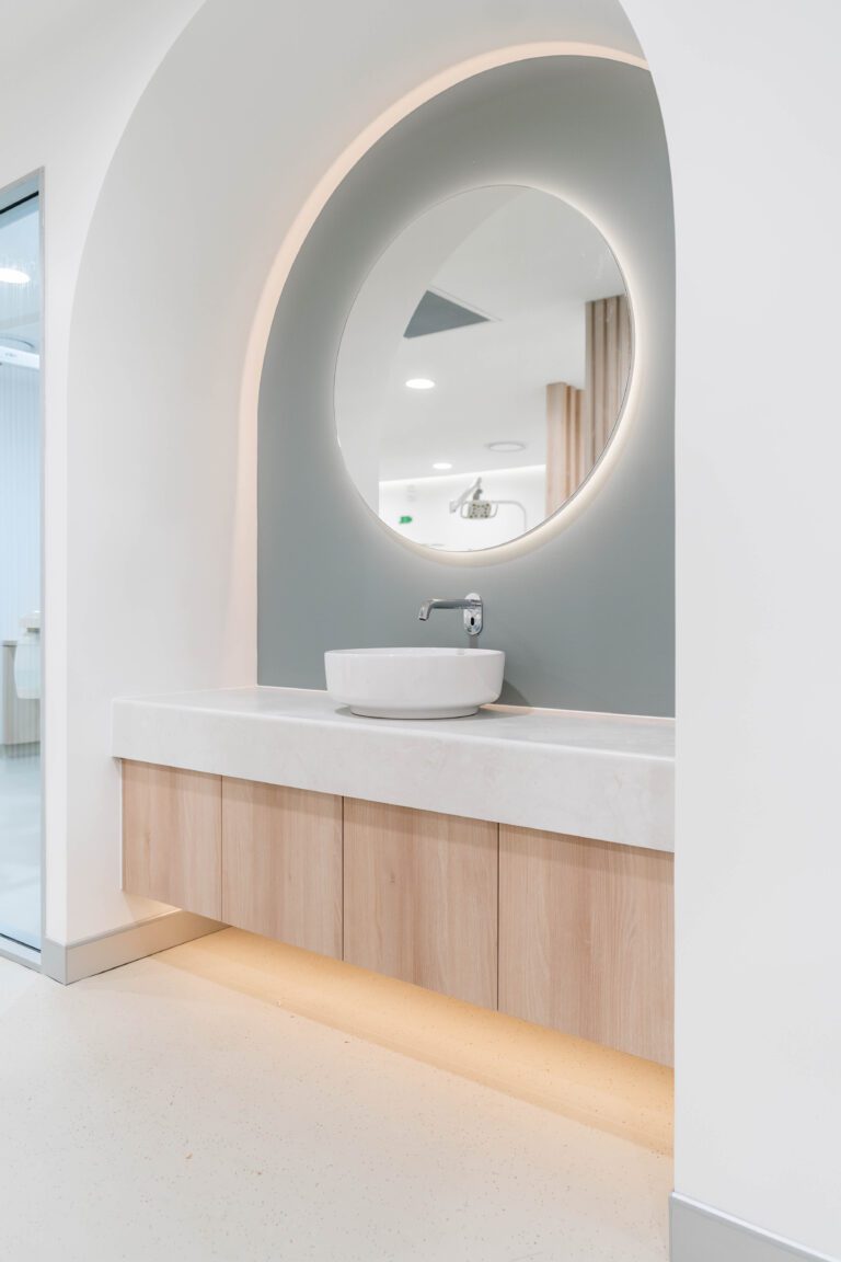
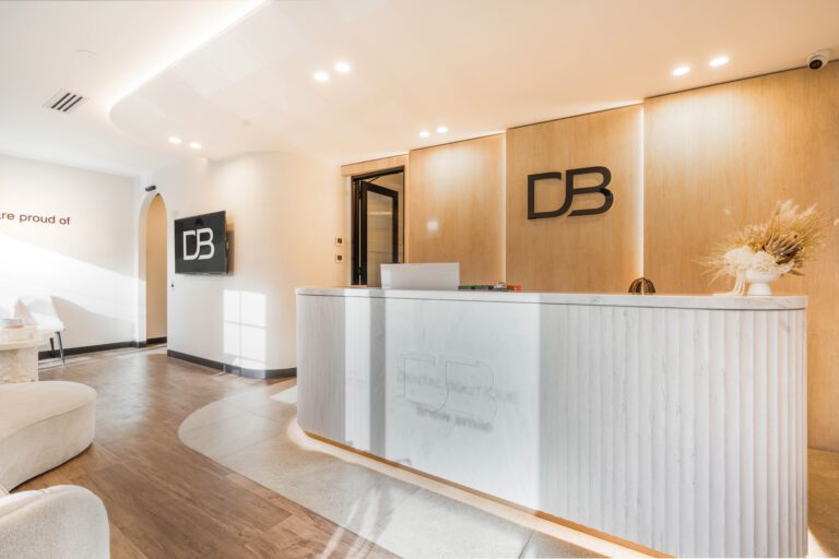
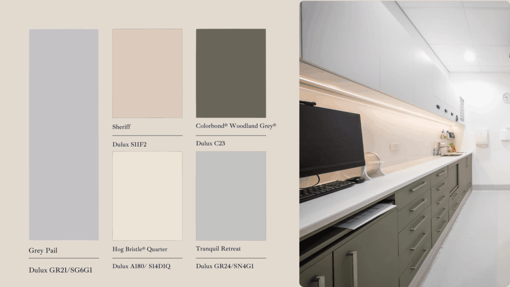
The Professionalism of Nuanced Neutrals
Whites, greys, and beiges are foundational in healthcare for their connection to cleanliness and professionalism. However, a purely neutral palette can feel cold and sterile. The key is to use them with nuance. Opt for off-whites with warm undertones, layer different shades of grey for depth, and balance smooth surfaces with natural textures like timber or soft furnishings to add warmth and prevent the space from feeling impersonal.
Colour Palette Recommendations by Space
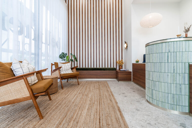
Reception and Waiting Areas
As the first point of contact, these spaces should feel welcoming and reduce anxiety. Soft neutrals, muted greens, and warm greys create a calming foundation. A feature wall with a soothing colour or natural textures like timber battens can add depth and personality without overwhelming the senses.
Treatment Rooms
Hygiene and functionality remain top priorities here, but the design shouldn’t be cold. Cool blues and pale sage greens support focus and calmness for both patient and practitioner. Using low-sheen finishes is also crucial to minimise glare from clinical lighting and ensure surfaces are easy to maintain.
Corridors and Transition Zones
More than just a path from A to B, corridors are key to wayfinding. A calm, neutral base of light taupe or soft grey maintains a peaceful atmosphere, while strategic use of colour can intuitively guide patients. For example, a subtle blue accent wall or a coloured floor line can signal the direction to treatment rooms, helping to reduce patient confusion and stress.
Wards and Consultation Rooms
In spaces where patients spend extended time or discuss sensitive information, like in a dental office, comfort is paramount. Earthy tones, muted lavenders, and soft beiges create a soothing atmosphere that supports recovery and relaxation. Adjustable lighting that complements these palettes can further support circadian rhythms and create a restful environment.
Staff Break Rooms and Offices
An often-overlooked but critical area, staff rooms are where your team recharges. The colour palette here should support rest and rejuvenation. Calming greens and blues can help reduce stress and mental fatigue. In administrative areas, colours that promote focus without causing strain, like soft grey-blues or gentle teals, can improve productivity and staff wellbeing.
Tailoring Palettes to Clinic Type & Demographics
A one-size-fits-all approach to colour doesn’t work. For the most effective results, tailor your palettes to the specific patients you serve and the type of care you provide.
Paediatric Clinics: Playful yet Peaceful
The goal here is to create a friendly, non-intimidating environment. This requires a balance between engagement and calm. Consider a neutral base palette to keep the space from feeling chaotic, then introduce brighter, playful colours in specific zones—like a feature wall in a play area or as accent colours on furniture. These pops of colour can serve as a positive distraction for anxious children.
Geriatric Centres: Clarity and Comfort
Design for seniors must account for the physiological changes in vision that occur with age. High-contrast colour combinations are essential for safety and navigation—for instance, making sure door frames contrast with walls and flooring contrasts with furniture. To reduce glare and visual stress, choose softer, muted tones over bright, primary colours to create a space that feels safe and familiar.
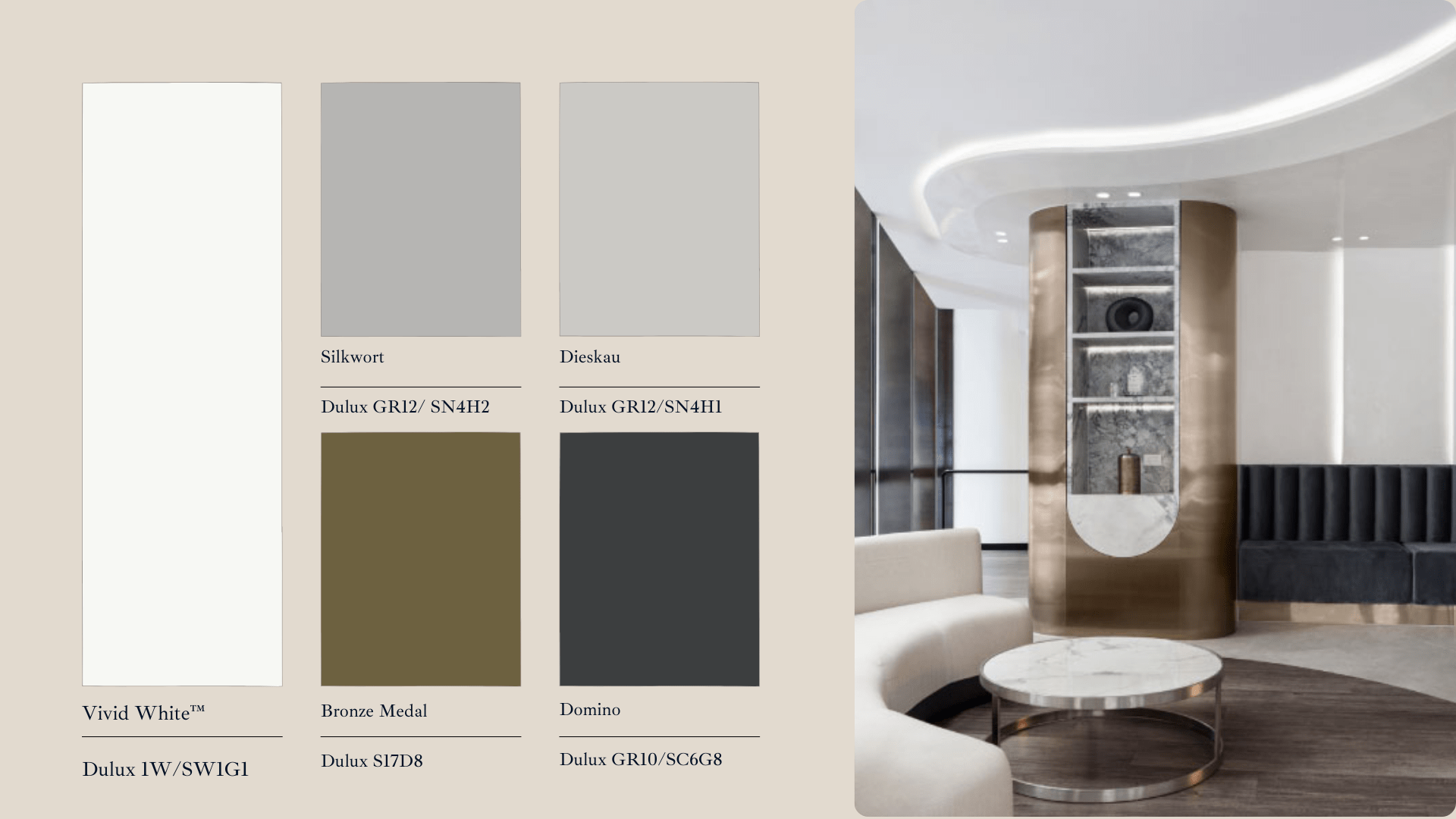
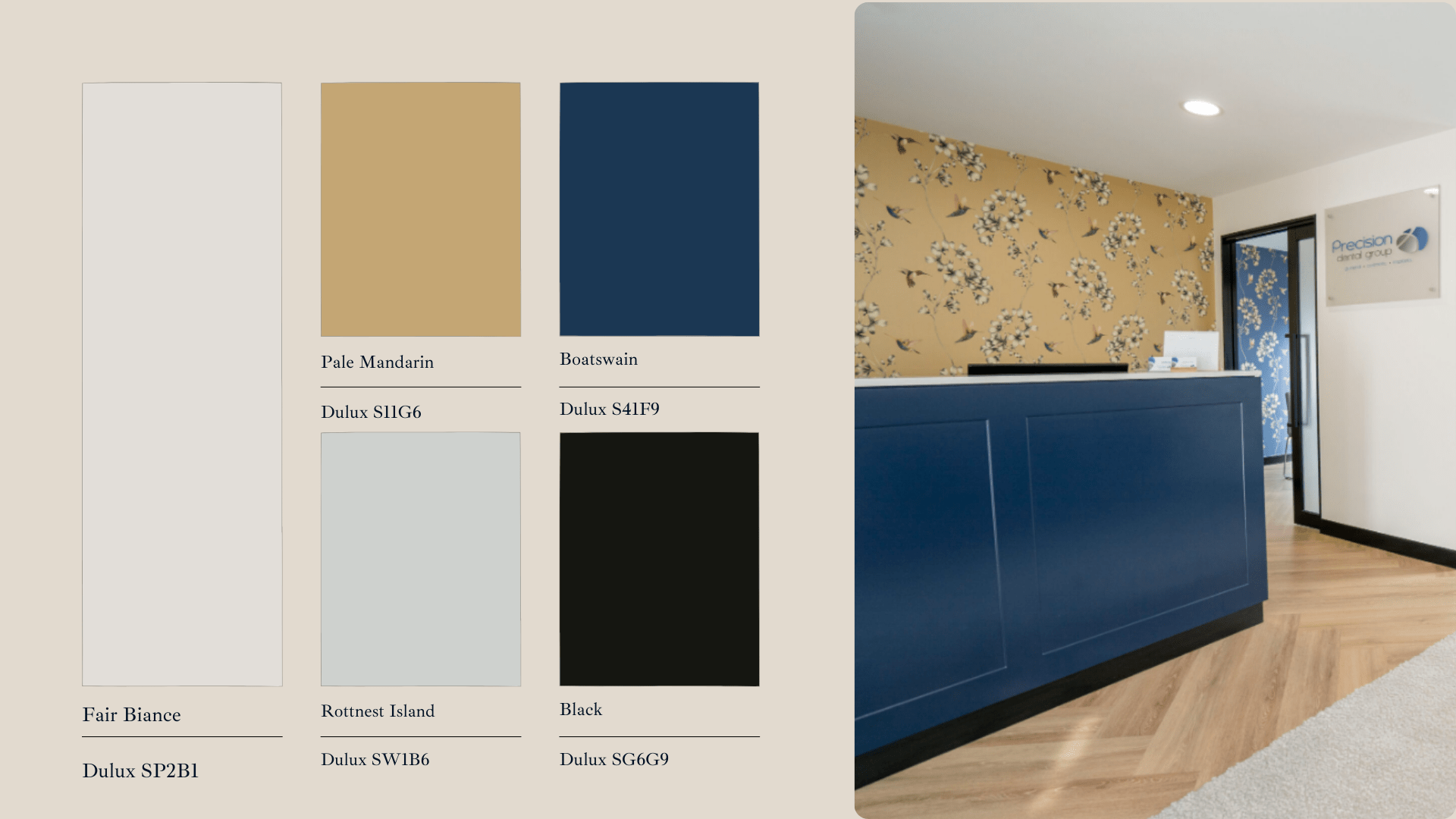
High-End & Specialist Practices: Sophistication and Discretion
For cosmetic surgeries, private consulting suites, or dental boutiques, the environment must reflect the premium quality of the service. Deep navies, rich charcoals, and monochromatic palettes paired with warm taupes and champagne beiges create an atmosphere of sophistication. Accents of brushed brass or other metallics can elevate the look, conveying luxury and discretion.
Aligning Colour with Your Design Goals
For minimalist and modern spaces, a combination of cool greys, crisp whites, and deep charcoal accents delivers a clean, streamlined aesthetic. This style works particularly well in high-tech clinics or specialist practices aiming for a sense of precision and innovation.
If your goal is to create a warm and welcoming atmosphere, especially in family clinics or community centres, opt for softer tones such as dusty pinks, olive greens, and warm ochres. These colours create a gentle, approachable feel that puts people at ease.
A nature-inspired or biophilic approach can be particularly effective in wellness-focused spaces. Think eucalyptus greens, sandy beiges, and soft sky blues. These palettes not only reduce stress but also connect patients to a more natural, restorative environment.
Your choice of colour should also reflect your clinic’s brand identity. Consistent use of colours that align with your logo, values, and service style can create a memorable and cohesive patient experience.
Bringing It All Together with RiteSpace Construction
At RiteSpace Construction, we see every project as more than just construction. It’s about creating environments that reflect your values, support efficiency, and leave a lasting impression on patients. Our colour palette choices work seamlessly with lighting, finishes, and acoustics to deliver spaces that perform as well as they look.
By selecting adaptable colours and finishes, we future‑proof clinics so they can evolve without major redesigns. The result is a space that serves you today and adapts for tomorrow.
Ready to design a clinic that inspires confidence and care? Book a consultation with our in‑house team, and we’ll guide you through tailored colour and material selections to bring your vision to life. Looking for inspiration or the upcoming trends, download our free eBook to stay up to date.